No. 80 - Booleans : Primeval numbers : Incomplete City
completely in the hands of the children
My name is Linda. I write a bi-weekly newsletter about computer science, childhood, and culture.
Last December, I received an email. It began like this:
“Hello there!
My name is Irma, I'm a design student at the Umeå Institute of Design. I’m currently gearing up for my bachelor thesis this coming spring.”
Normally, I decline student projects—I’m just one person, and I don't have the capacity to properly guide thesis work. Plus, I’m not very academic in my thinking and I'm terrible at delegating tasks. But this time, something felt different. I'm really glad Irma and I started working together, exploring themes like playgrounds, activity panels, computational thinking, and learning through tactile experiences.
The thesis was a true highlight of my spring, and I hope we'll get to build this concept in a future park. Here’s a short interview with Irma. More on her projects here.
Can you talk a little bit about the research you did for the project? What or who inspired you in playground designs(or elsewhere)?
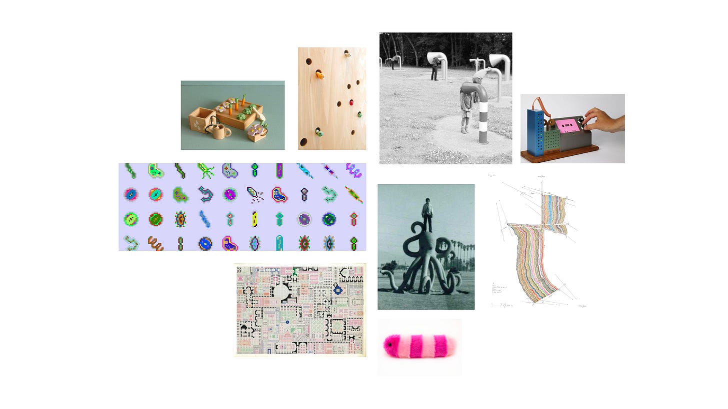
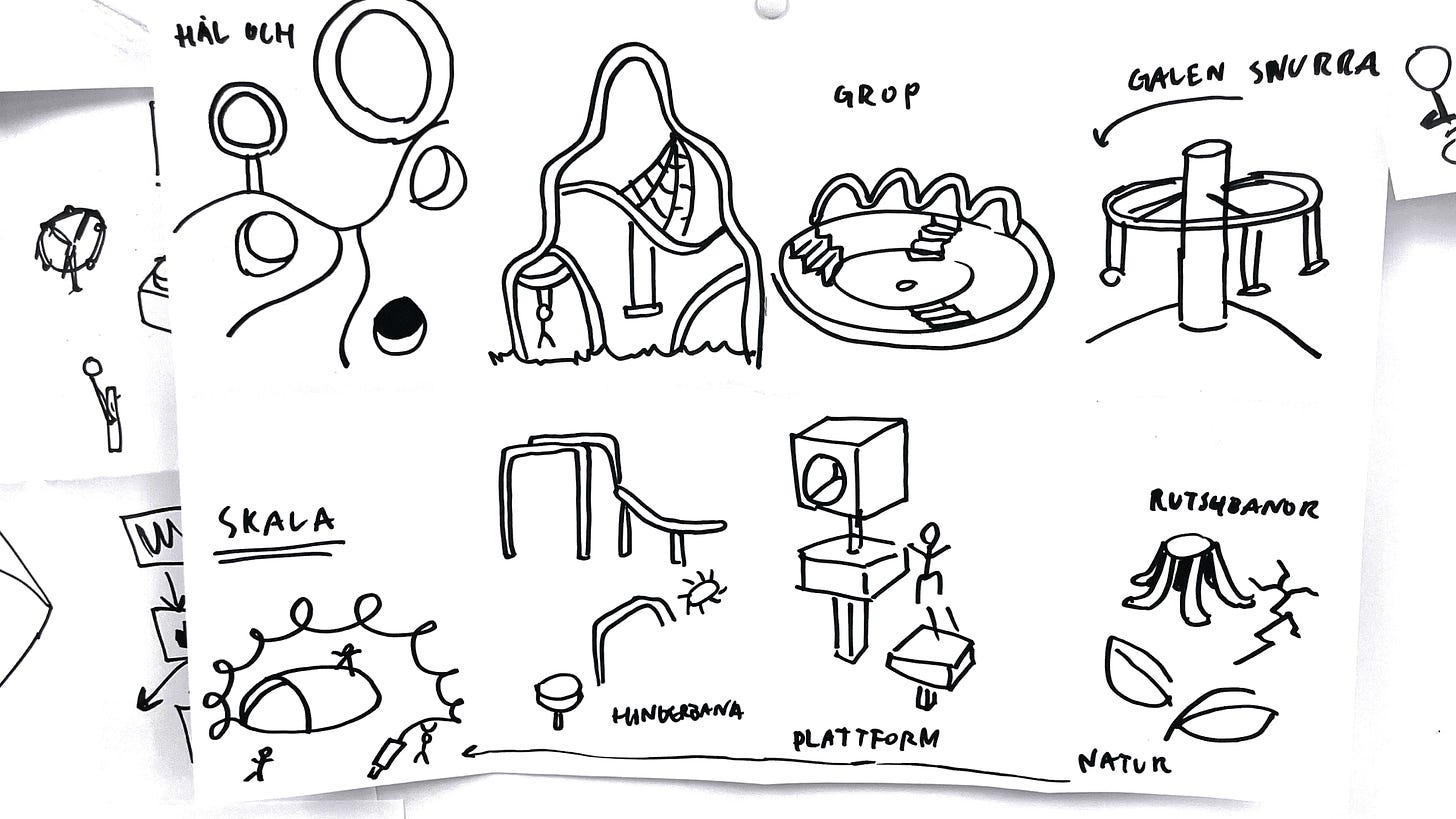
For my research, I was really exited to dive headfirst in a wide range of fascinating subjects that connect playgrounds and education in computer science, both aesthetically and philosophically. I drew inspiration from Montessori principles, the Danish "learning through play" approach, pedagogical literature on computer education like Sherry Turkles ”Second self”, and even biomimicry in technology. I was intrigued by how the structured, logical aspects of computer science could be compared to the softer values of creativity and the unpredictable beauty of nature. Nature was a major influence, especially since the project was set in the context of an outdoor playground.
Generally in my own design practice I am drawn to basic geometry, and as I explored playground design as sources for inspiration I got caught on Isamu Noguchis playgrounds, that really take advantage of big geometric shapes in a playful and interesting way. “I think of playgrounds as a primer of shapes and functions; simple, mysterious, and evocative; thus educational.”
With these thoughts in mind, I approached children in my workshops, not looking for answers - but rather a feeling. And this led to some truly interesting insights! One example of a lightbulb moment came when I asked the kids whether they thought a computer was more like a tree or a person. Their responses were whimsical and mysterious in the best possible way, providing imaginative perspectives that deeply influenced and gave lots of energy to the project.
How was it different to design for public space as opposed to a physical or digital product?
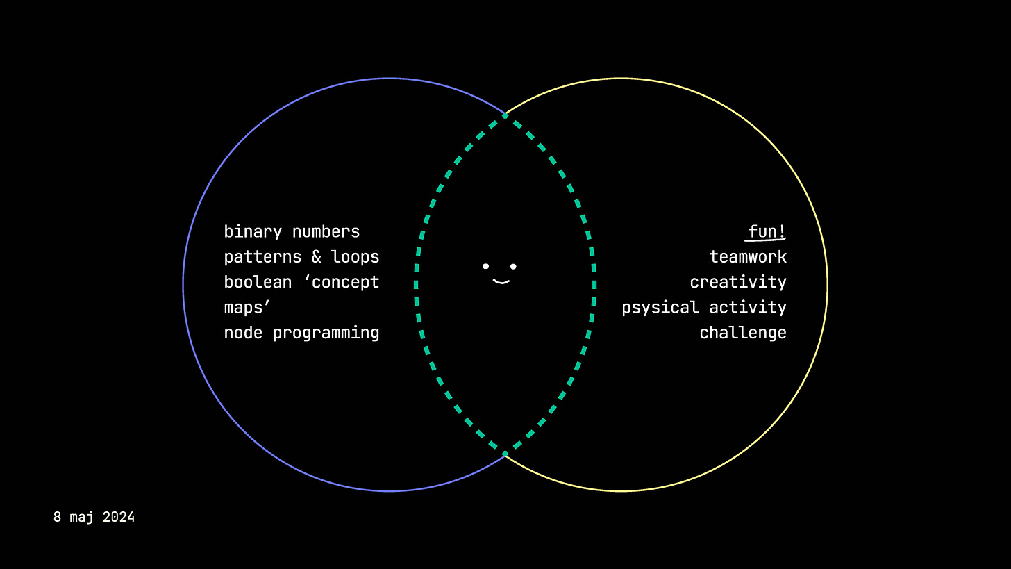
As the project progressed, it became very important to me that the result reflected values of inclusivity in various ways, since it sits in the public space. One of the main drivers was to attract children who might not traditionally be interested in computer education, especially girls. I quickly realized that designing something meant for everyone is really hard…
However, I truly do believe that open-ended play, where everyone is free to decide their own play and goals, could be the most democratic approach in this case. This idea is supported and somewhat influenced by Johan Redström's text, "Towards User Design? On the Shift from Object to User as the Subject of Design." Where Redström discusses that it's not just about the designer creating for the user, but more about the user while using is designing in collaboration with the designer. This is something I hope will happen with Booleans, that children, adults or whoever finds Booleans intriguing come up with ways to use it that I never would have thought of!
What were the principles or values that influenced the design of Booleans? Why did you choose sand in the end? What about the shape and modularity?
One quote from that particularly resonated with me from The Value of Play, Helle Marie Skovberg, Tilde Bekker, was: "An example of open-endedness is the choice to keep the feedback information fairly abstract... Children can embed the abstract feedback in their play in different ways and link it to different meanings in their games.”
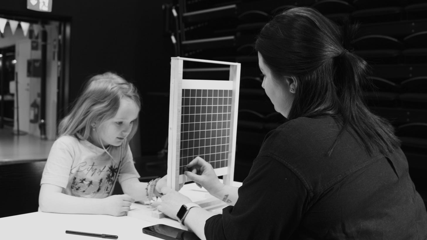
Sand is truly a well know material in the playground context that feels completely in the hands of the children. While parents are afraid of getting dirty, it’s the children who bake, build and take control. Also linking back to the research where nature was a source of inspiration it felt like the perfect balance, where mechanics played together with something so whimsical and natural as sand.
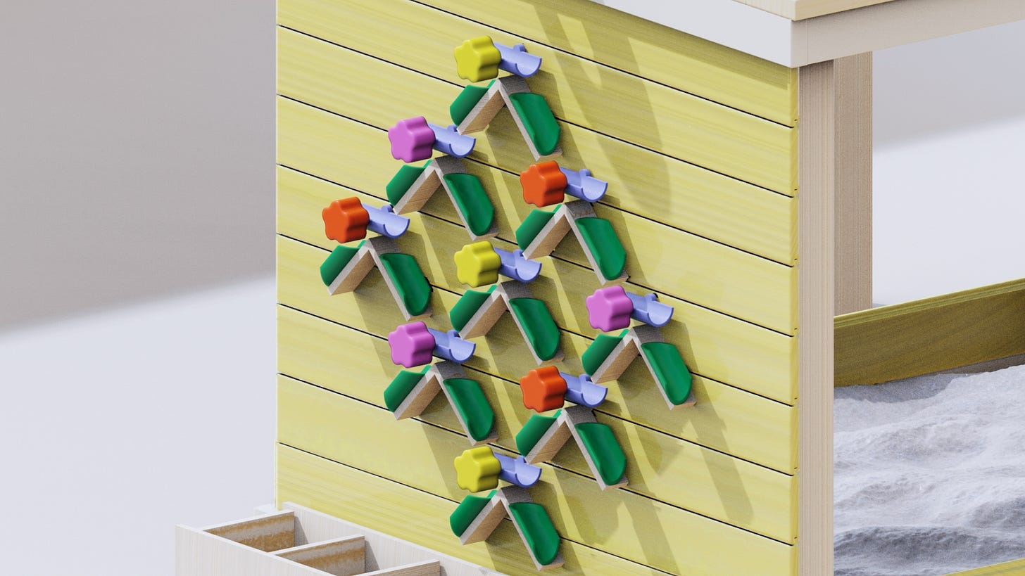
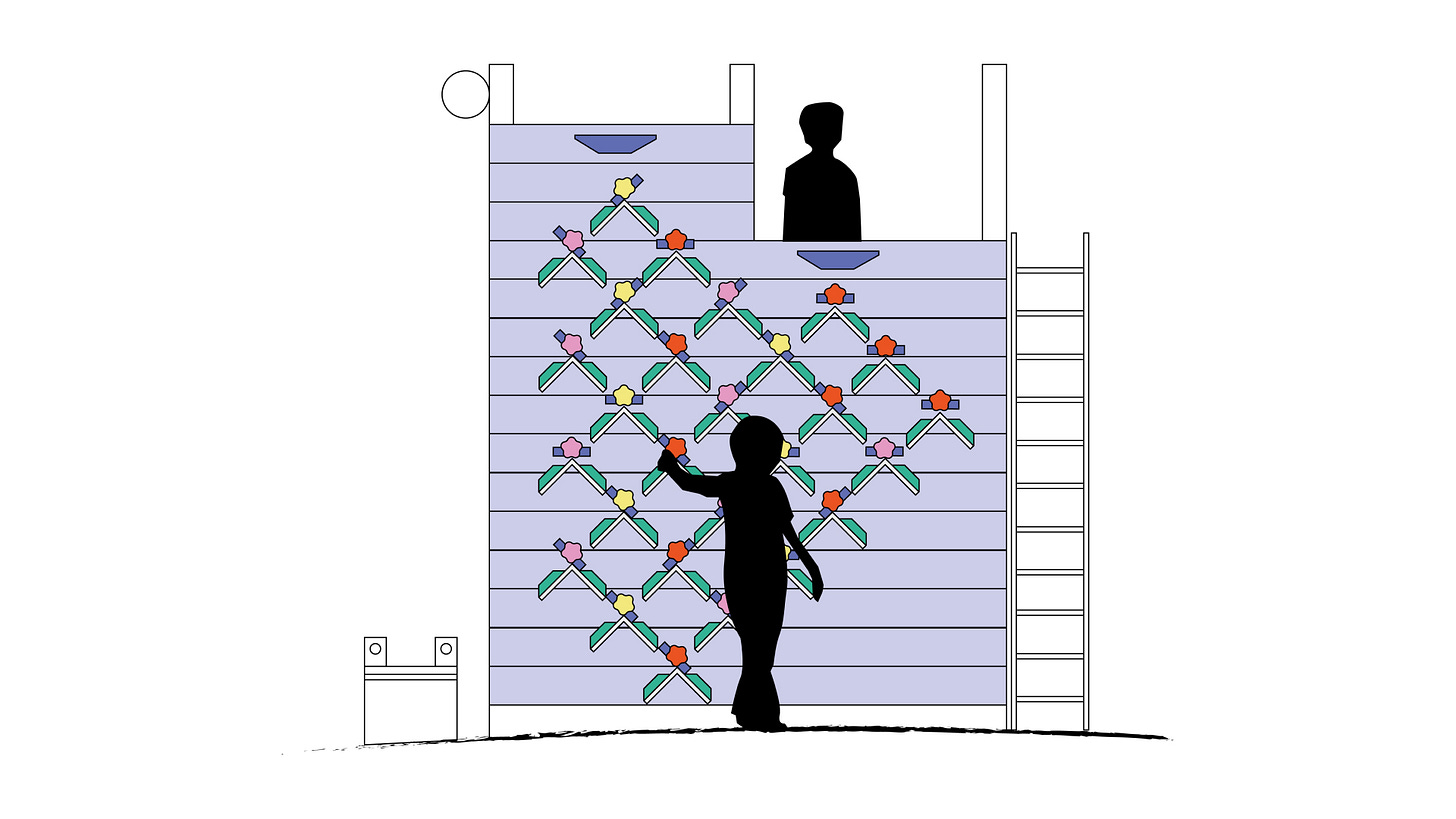
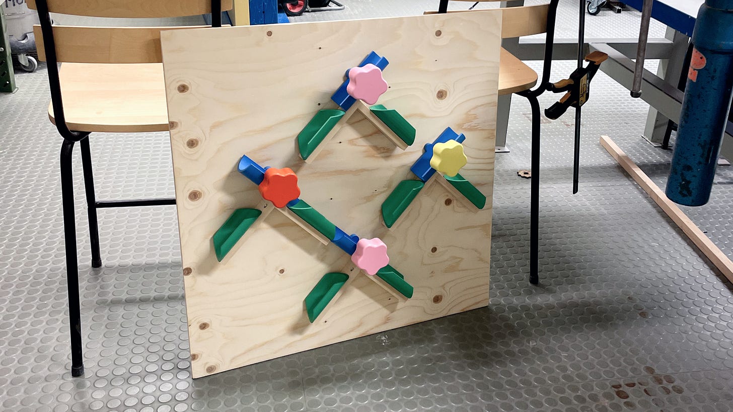
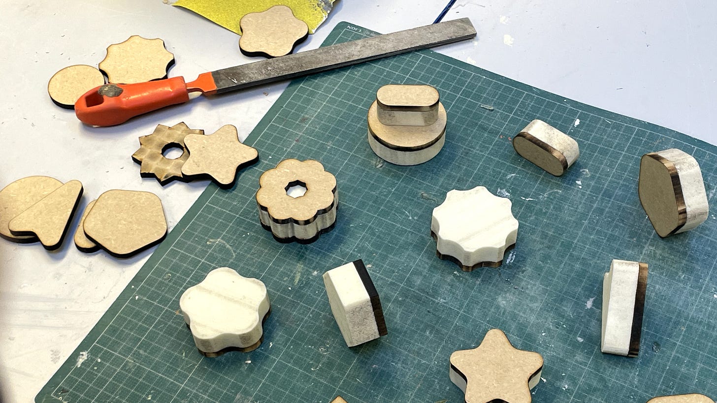
The switches take on the shape of both something that kids might want to grab on to, but is also the imagery of a flower. The green tubes then becomes leaves and the composition almost looks like a blooming flower wall!
The modularity is something I believe partly comes from my time at The LEGO group, where I often seek for parts to fit together, creating a system of play and allowing for customization and for the ”product” to fit different playgrounds and contexts.
What were some of the challenges you faced with Booleans? What were some of the choices you feel proud about making during the design process?
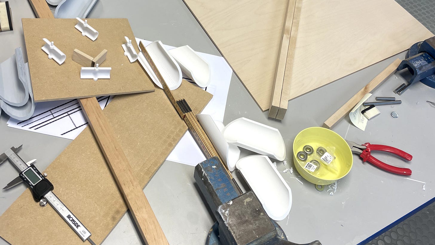
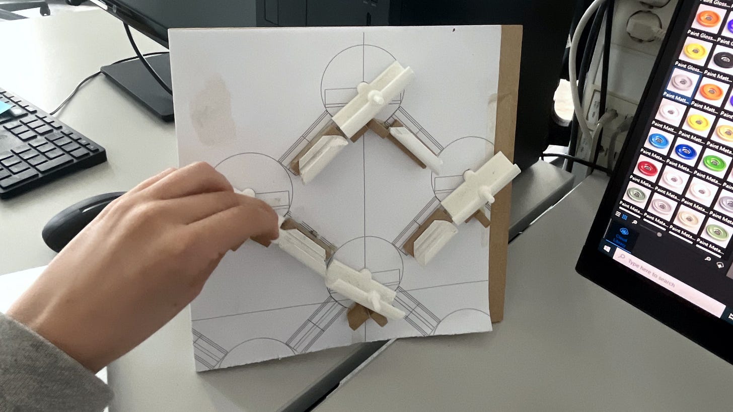
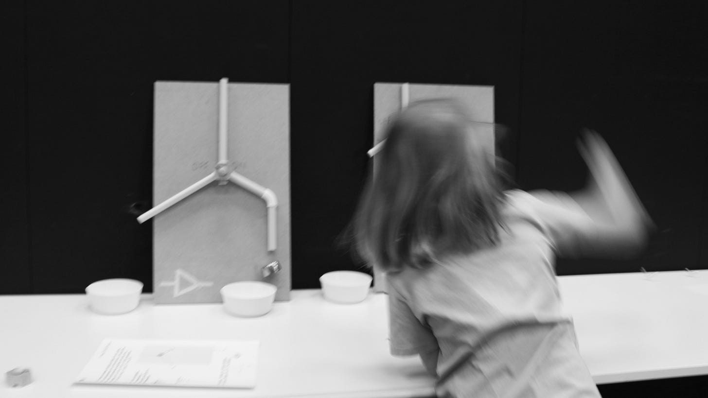
I reached a point in the project where I had gathered tons of interesting insights and inspirations and even built mechanical logic gates out of PVC tubes that were very literal in what they taught the kids. When I tested them, the children weren’t really interested in the exact mathematics but were fascinated by the sounds, sensations, and surprising elements. However, I still hadn’t defined the exact design. I felt pressured from many different directions to develop something with a clear goal, thinking that the success depended on how well the kids learned. Elements of competition started to creep in, which left me with a bad feeling.
At this point, with support from Linda, I did something I’m really proud of—I took a step back and followed my gut. I realized it wasn’t about competition; it never was from the beginning. The heart of the project was about open, creative play where kids decide for themselves. This is when the idea of incorporating sand became crucial. Sand, a well-known playground material, is perfect because it’s entirely in the hands of the children, allowing for endless possibilities and creativity.
What does curiosity mean to you?
To me curiosity means getting to have the (privilege), confidence and energy to truly explore the world around us, with an open and optimistic mind, not being afraid to fail!
What’s your favourite playground equipment and why?
As a quite adventurous child, I loved the swings. But I also have vivid memories of rainy days at kindergarten. We would pour, paint, splash in the water, and have the time of our lives. Looking back, I really believe we all need to do more of that. (even adults) We should stop being so afraid of getting cold or wet and just enjoy ourselves. :)
Linked List
In computer science, a linked list is a linear collection of data elements whose order is not given by their physical placement in memory. But here it is a selection of things I’ve been reading lately.
I’m reading Chaim Gingold’s Building SimCity: How to Put the World in a Machine (here’s a lovely discussion on the book). Meanwhile, this end-of-semester project at the University of Michigan called Incomplete City looks like a dream. In it, “groups of students draw a village for 100 people responding to a particular set of user needs. Then we merge pairs of villages, then merge again and again until all of the groups become one and the city is a single boisterous whole. This is all done with cutting, pasting, and drawing on paper”. I used to do something like this on my own as a kid.
Grapat. I’m obsessed with this toy brand from Catalonia. It's all about loose-parts play, ordering, and imagination. Grapat means “a handful” in Catalan, and just look at these.
Primeval numbers. A method for writing numbers using their prime factors instead of digits. I love the visual design (inspired by the Inca record-keeping technology quipu and the alien language in the 2016 movie Arrival)
Classroom
I’m hoping to surface and share stories from all of you and I’d love to see your creations! Here are a few teachers using Ruby in creative, fun and inspiring ways.
A video of Irma explaining more of her project!
BBC just ran a lovely profile on Hanna Harris, the chief design officer of Helsinki, who I’ve had the pleasure of working with on the the playground project for a few years now. I got to talk about the design process too!
Lovely words from an Italian educator. I love my Italian publisher; their catalogue is impeccably intelligent and friendly.


