My name is Linda. I write a bi-weekly newsletter about computer science, childhood, and culture.
For almost four years, I’ve been keeping a folder with notes, images, and clippings in anticipation of when the Ruoholahti playground would be ready. I’ve always loved the “how things are made” genre, the detailed journey from draft to real life, so today, I’m sharing a behind-the-scenes look at the research, style testing, building, and construction that brought this park to life.
(Sidenote: Seeing these sketches evolve has made me understand what scaling means to me — from a small drawing in a notebook to a six-meter tower in real life.)
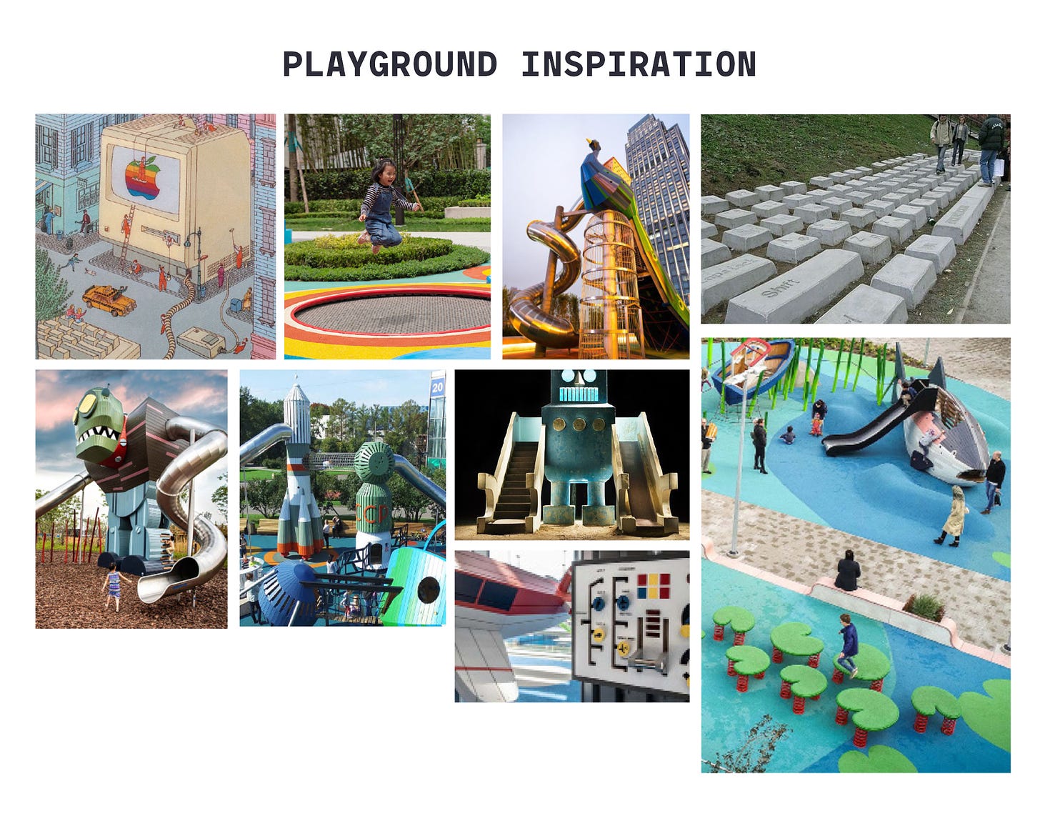
Playgrounds are both public and hidden spaces. My research began with understanding playground design, aesthetics, and the broader built environment. Placing this project within the wider landscape of standardized playgrounds, adventure playgrounds, and other play structures helped me build a vocabulary and frame the vision. Artists like Carsten Höller, Yinka Ilori, Florentijn Hofman and Toshiko Horiuchi MacAdam have also influenced my thinking with their artistic approaches to playgrounds.
I explored books, websites, and physical parks, paying close attention to design choices. The RIBA London Bookshop proved invaluable!
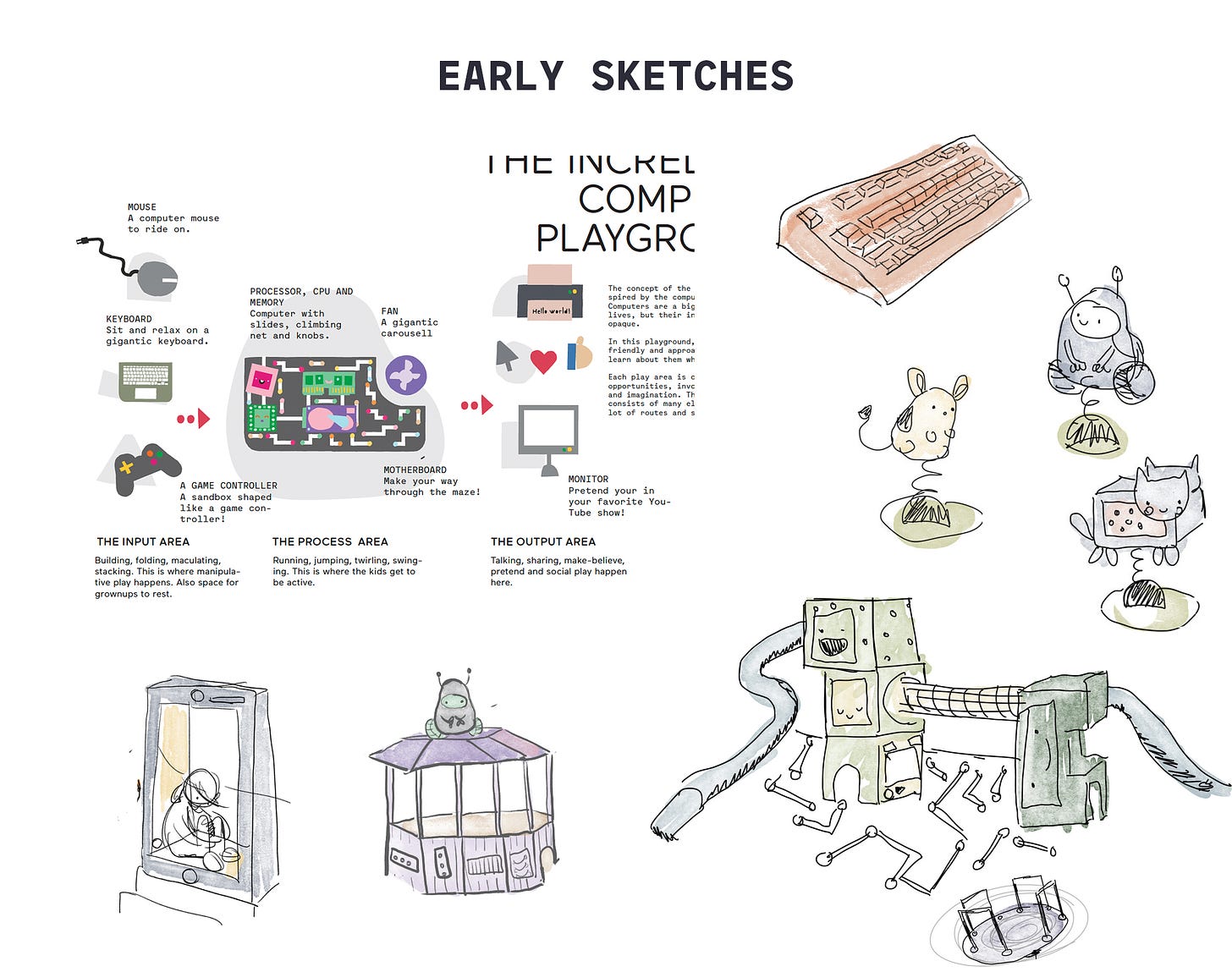
The first concept sketches for this playground are from the fall of 2020. These early drawings outlined a rough structure, dividing the space into areas for input, processing, and output—echoing the flow of computation.
Among the inspirations that shaped my ideas about computational themes were John Maeda’s Human Powered Computer and Taeyoon Choi’s CPU Dumplings. I also created an Are.na channel to store ideas for future playground projects.
Before long, the project moved into the official planning phase, bringing on board a landscape architect and a steering group made up of city representatives. Compared to creating picture books, this process felt new and complex, with different timelines and a multitude of small, critical decisions. I was lucky to work with a team that was patient and willing to explain each step—hopefully, next time, I’ll be a better collaborator.
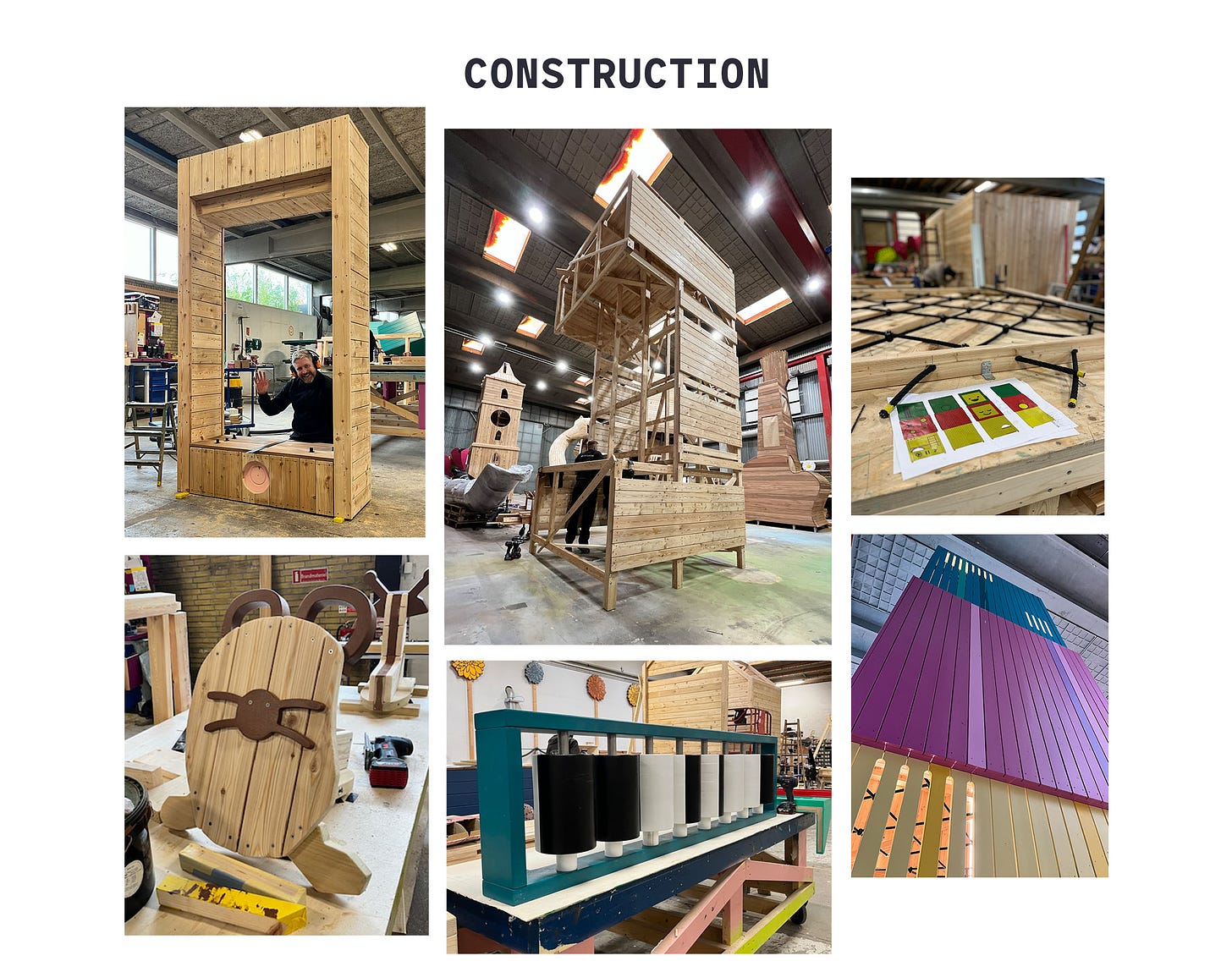
One of the most exciting moments was seeing my sketches come to life in the hands of Monstrum (all of the images that are not hand drawn are by them!) Watching these ideas take wooden shape in Copenhagen was a thrill.
In late 2020, I had some rough sketches but wasn’t sure how to weave a story around them, much less how to translate them into functional play structures. Hundreds of hours of work lie between those initial sketches and the final park. It’s fun to see how many ideas from 2020 survived into the finished design. Here are some of the guiding design principles I aimed for:
Parallel Play: The playground includes structures that encourage group play, like the rotating mobile phone and the computer hut with a chalkboard screen for collaborative work.
Open-Ended Interaction: Each play structure allows for multiple ways of engagement. These spaces aren't designed for a single, linear experience. For example, a computer tower made of abstract boxes or a sandbox shaped like a game controller can become anything children imagine.
Sense of Awe: I wanted kids to experience feeling both tiny and massive, like when jumping on a giant keyboard or crawling through the tunnell connecting the CPU to the RAM.
In addition to the physical structures, there was also a pedagogical idea behind each piece, which we’ll dive into in the next edition of the newsletter.
And if you're interested, here are some older posts about the project:
No 21 - Playgrounds 🤖 Public Spaces 📐 Architects for the very young
No. 22 — Paris 🇫🇷🗼 Pattern Language 🏙️ Kid City
No. 36 — Play/Pause ⏯️ My phone stuck its tongue out 😝 WingspanNo. 65 - Playground abacus ⫶ Stochastic Parrot ⫶ Parallel Computing in the Ancient World
No 76 — Playground construction ⫶ Worldbuilding ⫶ Jean Bartik
No. 85 — Playing in the streets ⫶ Pop-up computing ⫶ Shelf space
Linked List
Monument Valley 3 is coming out Dec 10th. If ustwo ever need a playground designer..
The Anchor Song. An analysis of Björk’s Anchor Song and C Ionian scale. Also found through this: “I once told my grandmother (who was an amateur oil painter) that the song was based on her colours and the compositions in her paintings she simply looked at me and said: I know”.
I’m in Berlin next week for beyond tellerand, there are still tickets. Come say hi! I would love to make a playground in Berlin too, the playspaces are so wild and special there.


